World Vision

Enhancing the Child Sponsorship Journey: A User-Centered Redesign

ROLE

UX Designer

DURATION

4 months

Background

End-to-End Journey for the Child Sponsorship and One-Life-Fund Programme

World Vision Singapore team come to us for one specifical goal in mind: to revamp their website to increase for a better user experience​. The scope of work involves just UX work. To design and optimize the end-to-end user journey for both the Child Sponsorship and One-Life-Fund programme. This includes enhancing the user experience from initial awareness through to the final sponsorship or donation, ensuring seamless navigation, clear communication of key information, and simplified access to relevant actions.

Scope of Work

Child sponsorship and One-Life-Fund

This redesign addressed the specific needs of the Child Sponsorship and One-Life Fund initiatives, focusing on creating an engaging and intuitive platform for potential donors to contribute meaningfully.

Identify problems within Child Sponsorship

Uncovering Gaps: Issues in the donation journey

To identify areas of friction within the Child Sponsorship journey, we began with a comprehensive website audit. This process involved a detailed examination of the existing user flow, mapping out the steps donors take to navigate the site, understand the Child Sponsorship initiative, and complete their contributions.

World Vision Singapore offers two distinct entry points for users upon visiting the website. When users first land on the site, they are prompted to choose between "I'm New" or "I'm a Supporter".

What we found after website audit

The Child Sponsorship flow poses barriers for users on their website journey

And by fixing these gaps, we allow for a smoother user experience

Child Sponsorship and Chosen

Interlink users between Child Sponsorship pages to increase product awareness

To improve user navigation and enhance clarity, it's crucial that users are able to find information that they need/that might help with their decision making. In the original design, there was no linking between the pages of Child Sponsorship and Chosen. Chosen is a unique experience where children select their own sponsors instead, flipping the process of traditional Child Sponsorship. By not linking these pages, it created a disconnect for users. Hence we proposed to change the flow to include links between the Chosen page and the Child Sponsorship page. This ensure that users can seamlessly explore both options.

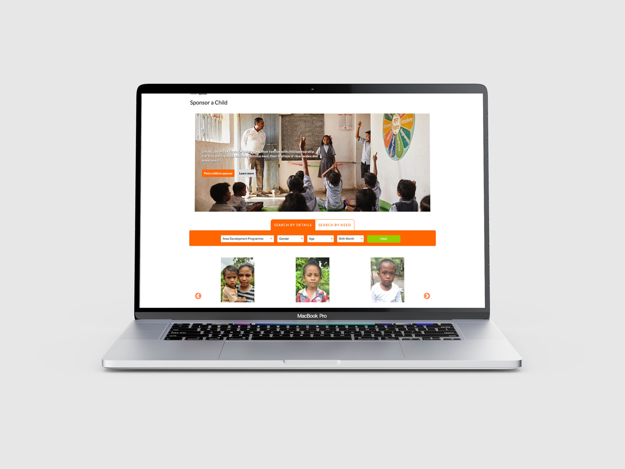
Sponsor page

Separate educational pages and filtered search results for faster checkout

What is Child Sponsorship page on the World Vision website is an effective feature, as it provides users with an informative space to learn about the program before committing to a sponsorship. By keeping educational content separate from the sponsorship actions, users can focus on understanding the program first, without distraction. Additionally, the filtered search results streamline the process, guiding users directly to relevant sponsorship opportunities.

User interviews

We then conducted user interviews to identify painpoints in specific areas on the website from user behaviour

To better understand user behaviour and uncover potential pain points on the website, we conducted user interviews. This allowed us to gain insights into how users navigate the site, what challenges they face, and where they encounter obstacles.

Total: 5 users

3 users= Donated to any Non-Profit Organisation
2 users= Donated to World Vision

After conducting the user interviews, we carefully synthesized the data by organizing key insights and verbatim quotes into a Word document. This process allowed us to identify recurring themes, pain points, and user needs, providing a clear understanding of user behavior.

Findings:

Homepage is too early for all users to make a sponsor decision

1

Users want transparency on how their donations support the child

2

Search functionality and extra steps create friction for new users

3

Solution

Which brings us to our wireframes iterations

After which, we started on the wireframe designs to address key pain points identified in the user interviews. However, due to limitations of the current CMS system, Drupal 7, certain design solutions could not be implemented as originally envisioned. To overcome these constraints, we proposed alternative designs that adhered to the CMS's capabilities while still enhancing the user experience. These adjustments ensured that the final recommendations were both practical and aligned with the client’s technical infrastructure.

Final designs

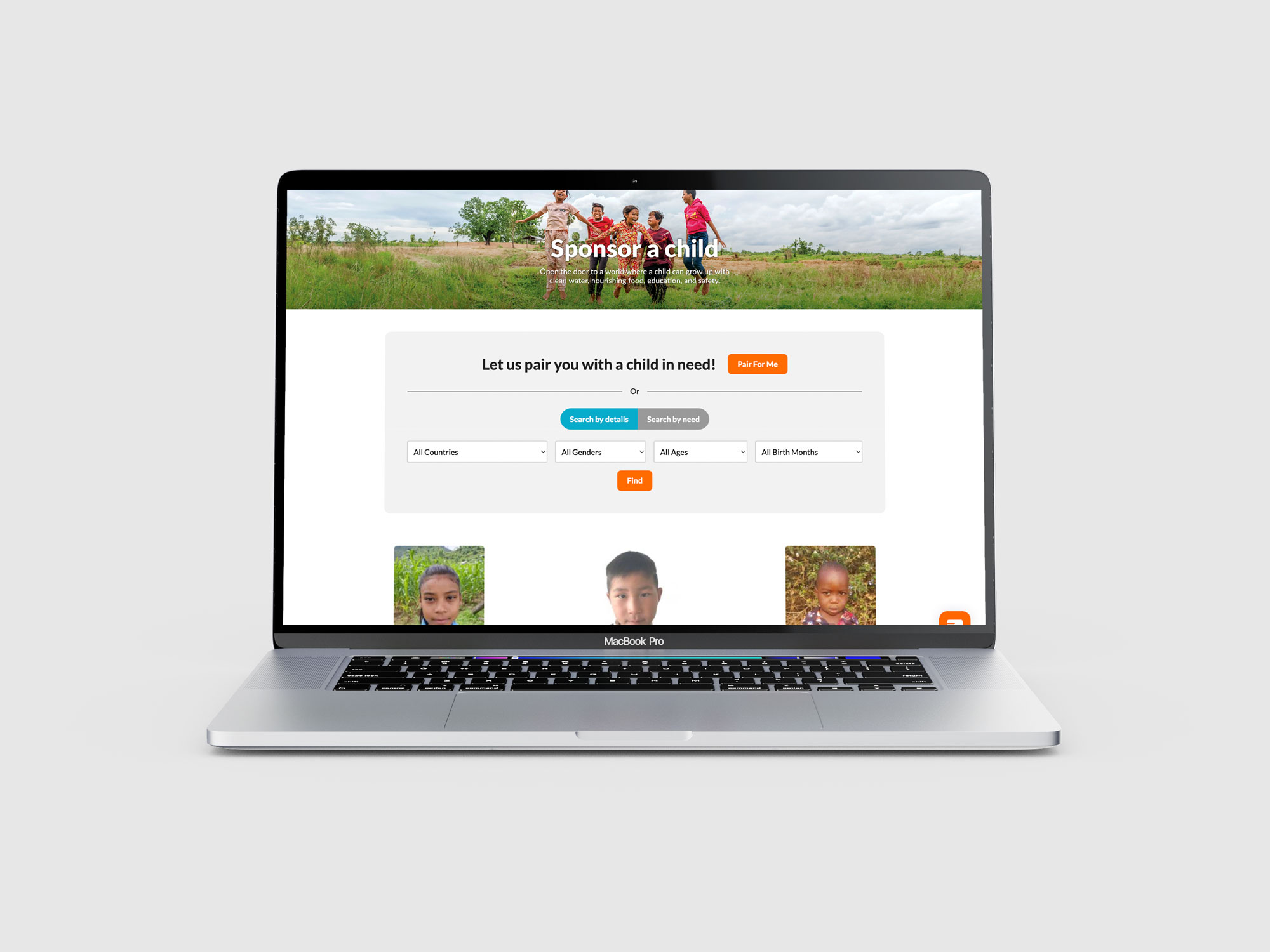
Finally after multiple wireframes iterations, we have successfully launched the designs

For the final designs, we prioritized showcasing how users' donations directly impact the child, as this is crucial information before they make a decision to sponsor. In the original design, the child profiles were displayed alongside the search module, which led to some users feeling uncomfortable swiping through profiles without a clear sense of direction for their donation. To address this, we redesigned the search module to allow users to first explore areas of need they wish to support before viewing child profiles. Additionally, we moved the search module to the top section of the website, ensuring that users can easily access it after understanding how their donations will help, leading them seamlessly to the call to action.

Final Takeaways

Conducting effective User Interviews

One important lesson I learned was the need to be clear about what we want to achieve from a user interview. Having a clear focus helps to structure the session and make the best use of time. It’s also important to ask open-ended questions that aren’t leading, so we can get honest feedback and understand the user’s true perspective